Our logos are the most important and recognizable elements of our brand’s identity. They are the visual focus for our brand and communicate who we are and how we differentiate ourselves from our peers.
The primary college logos feature a distinctive font, a shield drawn from the formal seal of the College and a cross. The shield incorporates a strong graphic element alluding to the “sunburst” that is found in the seal of the Society of Jesus. The design includes our full name to help us stand out from other organizations as audiences search for us in the cluttered online world.
The role and usage of each logo are explained on this page.
Note: Do not alter, redraw or add any additional words or graphic elements to the logo.
Download an abridged version of the logo usage guidelines (PDF) »
Questions?
- For print or other collateral applications, please contact the Department of Graphic Arts.
- For web and other digital applications, please contact web communications at web-request@holycross.edu.
Downloads
Download the JPEG and PNG versions of each logo in RGB format below. For other formats, please contact Graphic Arts or web communications. To save each file to your computer, right-click on the desired format and choose "save as..."
Primary College Logos
Within our logo system, there are two orientations of the logo (horizontal and vertical), which should fulfill the majority of logo usage needs. For co-branding needs, please contact Graphic Arts.
Some logos are displayed here on a gray background for visibility in this key; the background colors do not appear in the file. In each instance, the lines inside the shield are white, not transparent.
The shield may be used as an independent element. It may not be used in place of the full logo. A design that features an independent shield element (such as a watermark or background pattern) would still need the full logo incorporated.
Horizontals
Version 1
Version 2
Version 3
Verticals
Version 1
Version 2
Version 3
1-Color Reversed College Logos

this key.
The preferred application is on purple, but they may also be used on the College’s recommended color palette, or as needed on other colors. The single shield may be used as a watermark or design element, but may not be used as a replacement for the logo.
Shields
Formal Logos and Seals
The College of the Holy Cross seal and formal logo are reserved for special, formal applications such as official College documents, presidential reports, diplomas, applications, and other uses as determined by the president. The seals should only be used on a white background. The formal logos and seals are not available for download; please contact College Marketing and Communications for these assets.
Formal Logo

Formal Logo - Two Color

Formal Seals

- Version - Black: JPEG, PNG
- Version - Purple: JPEG, PNG
- Version - Full Color: JPEG, PNG
- Version - On Black: JPEG
- Version - On Purple: JPEG
- Version - Transparent: PNG
Formal Logo Reproductions
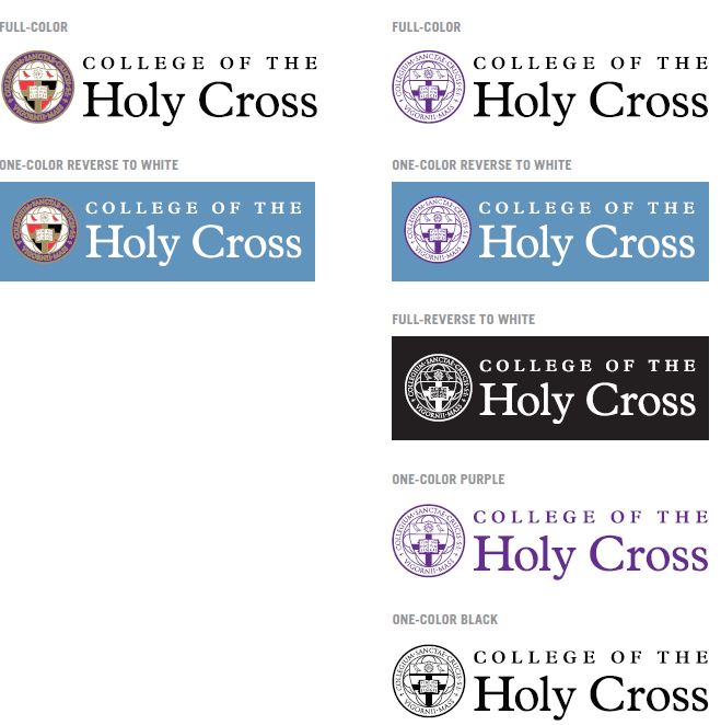
The only acceptable coloration options for the formal seal and two-color formal seal logomark are shown here.
The only version available for use for the formal seal are the full-color and one color-reversed logos.
Both the full-color logo and one-color versions may only be placed on a white background or on a light color background as long as there is enough contrast for the logo to be legible.
The full-reversed two-color logo may be placed on any dark color background as long as there is enough contrast for legibility. The full-reversed logo is the only version where the background color or image is allowed to show through. In all other versions of the logo the seal must have a white background.
Improper Use of the Logo
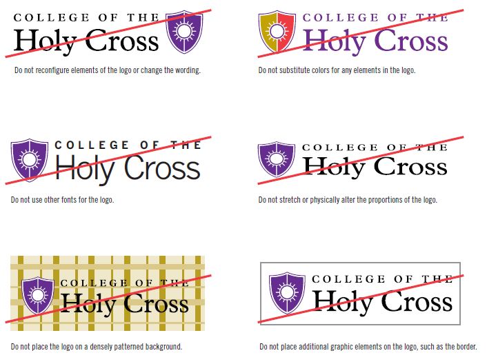
No elements of the logo should be modified. Some examples of what should be avoided are listed here. Avoiding these misapplications helps maintain the visual integrity of the brand and allows for a cohesive look across all materials.
The following list outlines the basic rules for working with the logo:
- Maintain the proportions of the logo as shown.
- Do not obscure any part of the logo.
- Do not add a drop shadow or any other special effects to the logo.
Applying the Logo
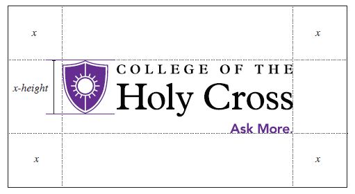
The College of the Holy Cross logo should always be afforded a predetermined area of breathing space, referred to as an area of isolation. This ensures that the identity maintains its hierarchy and is not overwhelmed by other visual elements. The area of isolation can be calculated as a margin of clear space equivalent to the height of the shield.
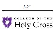
The original logo must always be reproduced so the width of the Holy Cross logo measures a minimum of 1.5” wide to ensure all elements of the identity are legible.
When the Holy Cross logo is used to signify a sponsorship, partnership or affiliation, a secondary area of isolation and identity lockup with another logo is needed. In this case, the Holy Cross logo should always appear first in sequence if it is dominant in the partnership agreement. If the Holy Cross logo is subordinate in the agreement/relationship, the logo should always appear second but adjacent, not underneath the other logo. The other logo must maintain a visual balance with the Holy Cross logo.
Logo Area of Isolation
Minimum Size
Co-Branding Lockup

Color Palette
The color palette is essential to communicating a consistent brand image for the College of the Holy Cross. Consistency and proper usage of the palette protects and strengthens the brand.
The Holy Cross palette includes core primary, secondary and neutral colors.
The primary palette colors are used in the full-color logos. They are to be strongly present across all communications and applications. The secondary and neutral palettes may be used as blocks of color to highlight important information and as accents to the Holy Cross purple and black.
The secondary and neutral palettes add variety, and are always used in combination with the primary colors. These colors are never to be used as a replacement or alternative to the core brand colors.
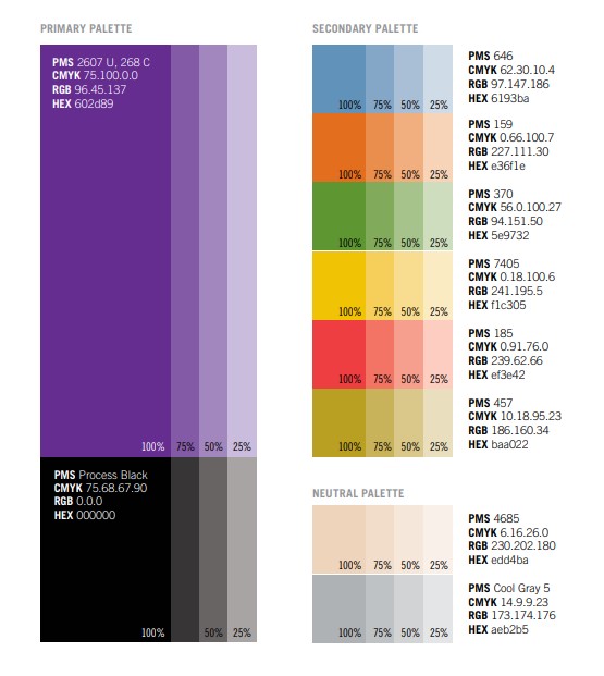
Color Application
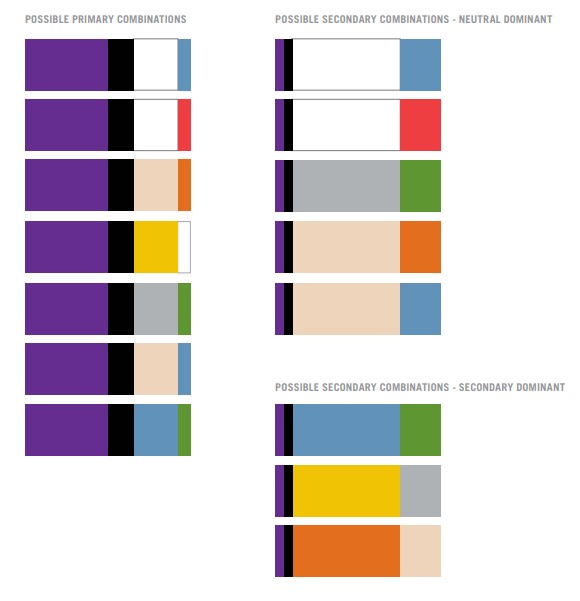
When applying the color palette on primary messaging documents use the Holy Cross purple as the dominant color with black or neutral color acting as an accent along with a secondary color from the palette.
When the design allows (multipage documents, websites, event collateral) use the primary colors as accents (or only in use in the logo). Depending on the design the neutral palette could be dominant with a secondary color the primary accents. Another possibility is to use a secondary color as the dominant color.
Many other combinations are possible. The main question is if the purple needs to be dominant or an accent.
Typography
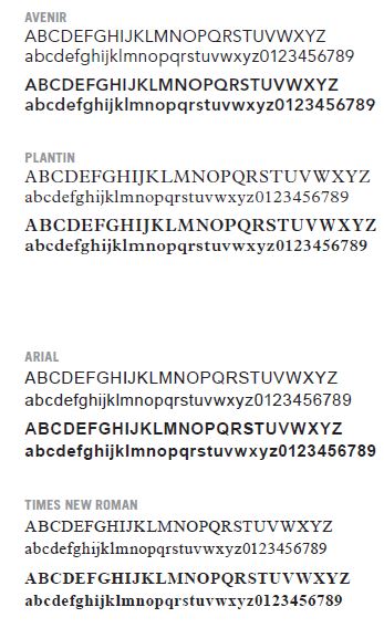
The Holy Cross logotype has been custom created and should NEVER be approximated by retyping the identity’s text component. The logos are provided as font independent file formats; it is not necessary to purchase these fonts for use of the logo.
When creating collateral materials, the typeface Avenir Book for subheads and body copy and Avenir Black should be used for headlines. For long-form text and call-outs use Plantin.
Arial and Times New Roman can be used for Microsoft applications when Avenir and Plantin are unavailable.
